Gauge
Gauge
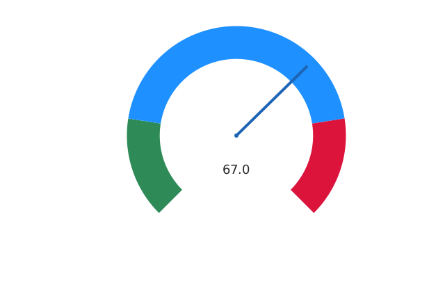
A gauge chart.
Usage
from dataviz_mojo import gauge
from dataviz_mojo.plot import save

def main() raises:
    var cpu_usage = 67.0

    var c = gauge(cpu_usage)
    save(c, "docs/src/examples/out_gauge.svg")
Args:
value: The reading to show, clamped (not rejected) to[min_value, max_value]– an out-of-range value pins visibly at the end of the dial.min_value: The dial’s low end; defaults to0.0.max_value: The dial’s high end; defaults to100.0, giving a plain percentage-style gauge with the defaultvalue.breakpoints: Ascending fractions of the full[min_value, max_value]span (e.g.[0.5, 1.0]for a low/high split); left empty (the default), reproduces ECharts’ fixed 20%/80%/100% bands unchanged.band_colors: One color perbreakpointsband, same length; left empty (the default), reproduces ECharts’ fixed green/blue/red bands unchanged.theme: Full styling knobs beyond this function’s own parameters (colors, margins, fonts, gridlines, …) – seeTheme’s docstring.width: Pixel width of the returnedPlot(.size()).height: Pixel height of the returnedPlot(.size()).title: The chart’s title, shown above the plot.subtitle: A secondary line shown under the title.x_title: The x-axis caption.y_title: The y-axis caption.