Quickstart
Install
Add it to your workspace’s pixi.toml as a git-source dependency:
[workspace]
preview = ["pixi-build"]  # git-source pixi dependencies are still a preview feature

[dependencies]
dataviz_mojo = { git = "https://github.com/randyzwitch/dataviz_mojo.git", branch = "main" }
pixi install/pixi run builds dataviz_mojo (and its canvas_mojo dependency) from that git ref and installs the resulting precompiled package into your workspace’s pixi environment.
A first chart using the Plot() builder
Plot is a fluent
builder: every method returns the plot itself, so calls chain into one
expression. Rather than one wall of code with every option already
turned on, this walks through the same scatter plot four times, adding
one piece at a time, so you can see exactly what each method
contributes on its own. It’s the same pattern behind every chart type
this package supports – once these four pieces click, .mark_bar(),
.mark_line(), .mark_pie(), and the rest all follow the same shape.
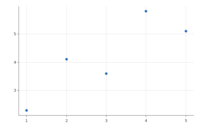
Step 1: Basic Scatterplot
Every chart needs three things: a mark (the geometric shape a data
row becomes – here, Mark.POINT, one dot per row), an encoding
(which data columns map to which visual channels – here, x and y
position), and something to actually write the result out.
from dataviz_mojo import Plot, save

def main() raises:
    var x: List[Float64] = [1.0, 2.0, 3.0, 4.0, 5.0]
    var y: List[Float64] = [2.3, 4.1, 3.6, 5.8, 5.1]

    var plot = (
               Plot()
               .mark_point()
               .encode(x=x, y=y)
               )
    save(plot, "chart.svg")
.mark_point() says “draw a point per row”; .encode(x=x, y=y) says
“this row’s position comes from these two columns.” save() renders
the plot and writes it out, picking the output backend from the file
extension – .svg for the SVG backend, .png/.bmp for the raster
one. That’s a complete, working chart – everything from here is
optional polish.
Step 2: Adding Axis Titles
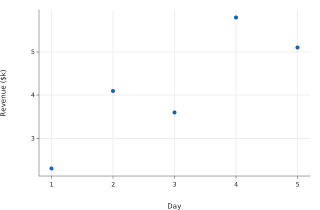
The chart above works, but “x” and “y” don’t mean anything to someone
else reading it. .labels() adds captions – text, not data – and
x_title/y_title caption the axes specifically:
from dataviz_mojo import Plot, save

def main() raises:
    var x: List[Float64] = [1.0, 2.0, 3.0, 4.0, 5.0]
    var y: List[Float64] = [2.3, 4.1, 3.6, 5.8, 5.1]

    var plot = (
               Plot()
               .mark_point()
               .encode(x=x, y=y)
               .labels(x_title="Day", y_title="Revenue ($k)")
               )
    save(plot, "chart.svg")
Same five points, same positions – .labels() only adds layout space
for the captions, it never touches the data or how it’s scaled.
Step 3: Adding a Chart Title
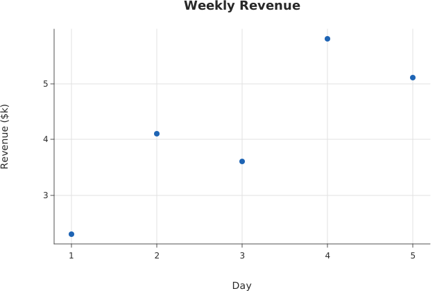
.labels() also takes title/subtitle for a headline above the
plot. One thing worth knowing before you reach for it: .labels()
sets all four captions together, every time you call it – a second
call with only title=... would reset x_title/y_title back to
empty, not layer on top of step 2. So the axis titles come along for
the ride in the same call:
from dataviz_mojo import Plot, save

def main() raises:
    var x: List[Float64] = [1.0, 2.0, 3.0, 4.0, 5.0]
    var y: List[Float64] = [2.3, 4.1, 3.6, 5.8, 5.1]

    var plot = (
               Plot()
               .mark_point()
               .encode(x=x, y=y)
               .labels(title="Weekly Revenue", x_title="Day", y_title="Revenue ($k)")
               )
    save(plot, "chart.svg")
Step 4: Changing Point Color and Size
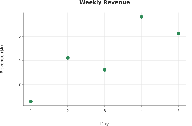
Everything about how a chart looks rather than what it means –
color, point size, margins, fonts, gridlines – lives on Theme, set
via .theme(). mark_color and point_radius are two of many knobs
(see the Theme reference for the rest):
from dataviz_mojo import Plot, save
from dataviz_mojo.colors import SEAGREEN
from dataviz_mojo.theme import Theme

def main() raises:
    var x: List[Float64] = [1.0, 2.0, 3.0, 4.0, 5.0]
    var y: List[Float64] = [2.3, 4.1, 3.6, 5.8, 5.1]

    var plot = (
               Plot()
               .mark_point()
               .encode(x=x, y=y)
               .labels(title="Weekly Revenue", x_title="Day", y_title="Revenue ($k)")
               .theme(Theme(mark_color=SEAGREEN, point_radius=6.0))
               )
    save(plot, "chart.svg")
Using scatter() instead of Plot()
Most mark types also have a one-call convenience function –
scatter(x, y), bar(categories, values), and so on – built on top
of the exact same Plot builder, for whenever chaining four methods
by hand is more ceremony than the chart needs. Every customization
from steps 2-4 is available as a keyword argument:
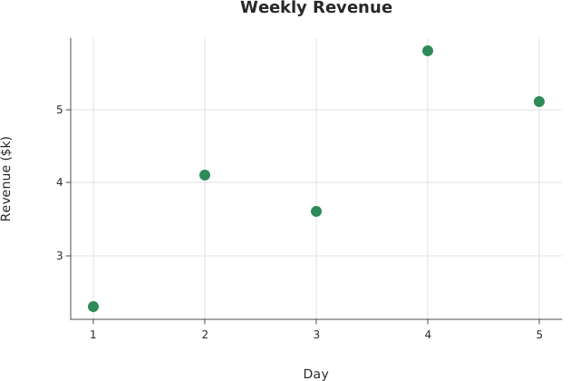
from dataviz_mojo import scatter, save
from dataviz_mojo.colors import SEAGREEN
from dataviz_mojo.theme import Theme

def main() raises:
    var x: List[Float64] = [1.0, 2.0, 3.0, 4.0, 5.0]
    var y: List[Float64] = [2.3, 4.1, 3.6, 5.8, 5.1]

    var plot = scatter(
        x,
        y,
        theme=Theme(mark_color=SEAGREEN, point_radius=6.0),
        title="Weekly Revenue",
        x_title="Day",
        y_title="Revenue ($k)",
    )
    save(plot, "chart.svg")
Pixel-for-pixel the same chart as step 4 – scatter(x, y) is
Plot().mark_point().encode(x=x, y=y) under the hood, plus whatever
keyword arguments you pass through to .labels()/.theme() for you.
Reach for the one-call form for the common case; drop back to the
full Plot builder for anything it doesn’t cover (multi-series
layering, facets, color/size encoding, …) – see the
Examples gallery for both, side by side, across every
mark type this package supports.
Where to next
- Examples – every chart type this package can produce, source code next to its actual rendered output.
- API reference – the full surface
PlotandThemeexpose, every scale, every mark.
Contributing to dataviz_mojo
This is an open-source project, MIT licensed – contributions are welcome. Found a bug? Want a chart type this package doesn’t have yet, or a docs page that’s unclear? Open a PR.
Request: if you’re planning something big – a new chart type, a rework of an existing one, anything on the order of ~50+ lines changed – open an issue before you start coding. This is not to gatekeep, but rather ensuring we agree on the approach before a lot of work goes into a PR. Small fixes, typos, and docs tweaks don’t need this – just send the PR.
There are several useful commands defined in the Pixi environment for development:
pixi run test      # tests/*.mojo
pixi run example   # every dataviz_mojo/*.mojo `Example:` docstring section, writes docs/src/examples/out_*.svg
pixi run docs      # regenerates this site -- run `example` first
License
MIT – see LICENSE.