Violin
Violin
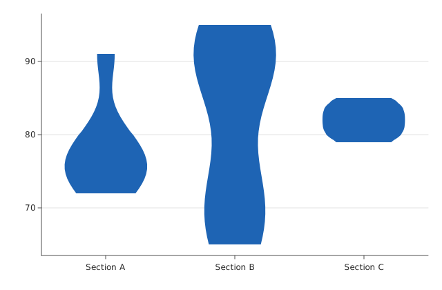
A violin plot.
Usage
from dataviz_mojo import violin
from dataviz_mojo.plot import save

def main() raises:
    var classes: List[String] = ["Section A", "Section B", "Section C"]
    var scores: List[List[Float64]] = [
        [72.0, 75.0, 78.0, 80.0, 74.0, 76.0, 91.0],
        [65.0, 70.0, 72.0, 88.0, 90.0, 92.0, 95.0],
        [80.0, 82.0, 83.0, 84.0, 81.0, 79.0, 85.0],
    ]

    var c = violin(classes, scores)
    save(c, "docs/src/examples/out_violin.svg")
Args:
categories: One silhouette per entry, in the given order.values: Each category’s raw values (values[i]) – the density estimate is computed from these, not passed in directly.bandwidth: Overrides every category’s Silverman’s-rule kernel-density bandwidth with one shared value; must be positive if given. Left at its default0.0, each category gets its own Silverman’s-rule bandwidth.scale_by_count:False(the default, ggplot2’sscale = "width") gives every category’s peak the same maximum width;True(scale = "area") additionally scales a category’s maximum width bysqrt(n_i / max(n)), so one built from fewer raw values draws visibly narrower.theme: Full styling knobs beyond this function’s own parameters (colors, margins, fonts, gridlines, …) – seeTheme’s docstring.width: Pixel width of the returnedPlot(.size()).height: Pixel height of the returnedPlot(.size()).title: The chart’s title, shown above the plot.subtitle: A secondary line shown under the title.x_title: The x-axis caption.y_title: The y-axis caption.