Visualizing Analytics Languages With VennEuler.jl

It often doesn’t take much to get me off track, and on a holiday weekend…well, I was just begging for a fun way to shirk. Enter Harlan Harris:

Hey, I’m someone looking for something to do! And I like writing Julia code! So let’s have a look at recreating this diagram in Julia using VennEuler.jl (IJulia Notebook link):

Source: Revolution R/KDNuggets

http://blog.revolutionanalytics.com/2014/08/r-tops-kdnuggets-data-analysis-software-poll-for-4th-consecutive-year.html

Installing VennEuler.jl

Because VennEuler.jl is not in METADATA as of the time of writing, instead of using Pkg.add() you’ll need to run:

1
Pkg.clone("https://github.com/HarlanH/VennEuler.jl.git")

Note that VennEuler uses some of the more exotic packages (at least to me) like NLopt and Cairo, so you might need to have a few additional dependencies installed with the package.

Data

The data was a bit confusing to me at first, since the percentages add up to more than 100% (people could vote multiple times). In order to create a dataset to use, I took the percentages, multiplied by 1000, then re-created the voting pattern. The data for the graph can be downloaded from this link.

Code - Circles

With a few modifications, I basically re-purposed Harlan’s code from the package test files. The circle result is as follows:

1
2
3
4
5
6
7
8
9
10
11
12
13
using VennEuler

data, labels = readcsv("/home/rzwitch/Desktop/kdnuggets_language_survey_2014.csv", header=true)
data = bool(data)
labels = vec(labels)

#Circles
eo = make_euler_object(labels, data, EulerSpec()) # circles, for now

(minf,minx,ret) = optimize(eo, random_state(eo), ftol=-1, xtol=0.0025, maxtime=120, pop=1000)
println("got $minf at $minx (returned $ret)")

render("/home/rzwitch/Desktop/kd.svg", eo, minx)

venneulercircles

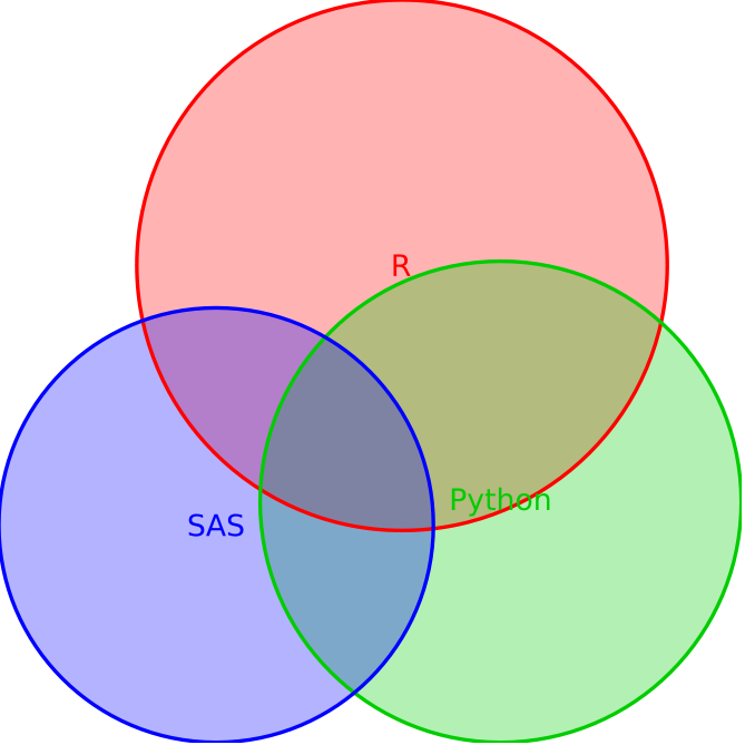
Since the percentage of R, SAS, and Python users isn’t too dramatically different (49.81%, 33.42%, 40.97% respectively) and the visualizations are circles, it’s a bit hard to tell that R is about 16% points higher than SAS and 9% points higher than Python.

Code - Rectangles

Alternatively, we can use rectangles to represent the areas:

1
2
3
4
5
6
7
8
9
10
11
12
13
14
15
16
17
18
using VennEuler

data, labels = readcsv("/home/rzwitch/Desktop/kdnuggets_language_survey_2014.csv", header=true)
data = bool(data)
labels = vec(labels)

# Rectangles
eo = make_euler_object(labels, data, [EulerSpec(:rectangle), EulerSpec(:rectangle, [.5, .5, .4], [0, 0, 0]),
    EulerSpec(:rectangle)],
    sizesum=.3)


(minf,minx,ret) = optimize_iteratively(eo, random_state(eo), ftol=-1, xtol=0.0025, maxtime=5, pop=100)
println("phase 1: got $minf at $minx (returned $ret)")
(minf,minx,ret) = optimize(eo, minx, ftol=-1, xtol=0.001, maxtime=30, pop=100)
println("phase 2: got $minf at $minx (returned $ret)")

render("/home/rzwitch/Desktop/kd-rects.svg", eo, minx)

venneulerrectangles

Here, it’s a slight bit easier to see that SAS and Python are about the same area-wise and that R is larger, although the different dimensions do obscure this fact a bit.

Summary

If I spent more time with this package, I’m sure I could make something even more aesthetically pleasing. And for that matter, it’s still a pre-production package that will no doubt get better in the future. But at the very least, there is a way to create an area-proportional representation of relationships using VennEuler.jl in Julia.

  • RSiteCatalyst Version 1.4.16 Release Notes
  • Using RSiteCatalyst With Microsoft PowerBI Desktop
  • RSiteCatalyst Version 1.4.14 Release Notes
  • RSiteCatalyst Version 1.4.13 Release Notes
  • RSiteCatalyst Version 1.4.12 (and 1.4.11) Release Notes
  • Self-Service Adobe Analytics Data Feeds!
  • RSiteCatalyst Version 1.4.10 Release Notes
  • WordPress to Jekyll: A 30x Speedup
  • Bulk Downloading Adobe Analytics Data
  • Adobe Analytics Clickstream Data Feed: Calculations and Outlier Analysis
  • Adobe: Give Credit. You DID NOT Write RSiteCatalyst.
  • RSiteCatalyst Version 1.4.8 Release Notes
  • Adobe Analytics Clickstream Data Feed: Loading To Relational Database
  • Calling RSiteCatalyst From Python
  • RSiteCatalyst Version 1.4.7 (and 1.4.6.) Release Notes
  • RSiteCatalyst Version 1.4.5 Release Notes
  • Getting Started: Adobe Analytics Clickstream Data Feed
  • RSiteCatalyst Version 1.4.4 Release Notes
  • RSiteCatalyst Version 1.4.3 Release Notes
  • RSiteCatalyst Version 1.4.2 Release Notes
  • Destroy Your Data Using Excel With This One Weird Trick!
  • RSiteCatalyst Version 1.4.1 Release Notes
  • Visualizing Website Pathing With Sankey Charts
  • Visualizing Website Structure With Network Graphs
  • RSiteCatalyst Version 1.4 Release Notes
  • Maybe I Don't Really Know R After All
  • Building JSON in R: Three Methods
  • Real-time Reporting with the Adobe Analytics API
  • RSiteCatalyst Version 1.3 Release Notes
  • Adobe Analytics Implementation Documentation in 60 Seconds
  • RSiteCatalyst Version 1.2 Release Notes
  • Clustering Search Keywords Using K-Means Clustering
  • RSiteCatalyst Version 1.1 Release Notes
  • Anomaly Detection Using The Adobe Analytics API
  • (not provided): Using R and the Google Analytics API
  • My Top 20 Least Useful Omniture Reports
  • For Maximum User Understanding, Customize the SiteCatalyst Menu
  • Effect Of Modified Bounce Rate In Google Analytics
  • Adobe Discover 3: First Impressions
  • Using Omniture SiteCatalyst Target Report To Calculate YOY growth
  • ODSC webinar: End-to-End Data Science Without Leaving the GPU
  • PyData NYC 2018: End-to-End Data Science Without Leaving the GPU
  • Data Science Without Leaving the GPU
  • Getting Started With OmniSci, Part 2: Electricity Dataset
  • Getting Started With OmniSci, Part 1: Docker Install and Loading Data
  • Parallelizing Distance Calculations Using A GPU With CUDAnative.jl
  • Building a Data Science Workstation (2017)
  • JuliaCon 2015: Everyday Analytics and Visualization (video)
  • Vega.jl, Rebooted
  • Sessionizing Log Data Using data.table [Follow-up #2]
  • Sessionizing Log Data Using dplyr [Follow-up]
  • Sessionizing Log Data Using SQL
  • Review: Data Science at the Command Line
  • Introducing Twitter.jl
  • Code Refactoring Using Metaprogramming
  • Evaluating BreakoutDetection
  • Creating A Stacked Bar Chart in Seaborn
  • Visualizing Analytics Languages With VennEuler.jl
  • String Interpolation for Fun and Profit
  • Using Julia As A "Glue" Language
  • Five Hard-Won Lessons Using Hive
  • Using SQL Workbench with Apache Hive
  • Getting Started With Hadoop, Final: Analysis Using Hive & Pig
  • Quickly Create Dummy Variables in a Data Frame
  • Using Amazon EC2 with IPython Notebook
  • Adding Line Numbers in IPython/Jupyter Notebooks
  • Fun With Just-In-Time Compiling: Julia, Python, R and pqR
  • Getting Started Using Hadoop, Part 4: Creating Tables With Hive
  • Tabular Data I/O in Julia
  • Hadoop Streaming with Amazon Elastic MapReduce, Python and mrjob
  • A Beginner's Look at Julia
  • Getting Started Using Hadoop, Part 3: Loading Data
  • Innovation Will Never Be At The Push Of A Button
  • Getting Started Using Hadoop, Part 2: Building a Cluster
  • Getting Started Using Hadoop, Part 1: Intro
  • Instructions for Installing & Using R on Amazon EC2
  • Video: SQL Queries in R using sqldf
  • Video: Overlay Histogram in R (Normal, Density, Another Series)
  • Video: R, RStudio, Rcmdr & rattle
  • Getting Started Using R, Part 2: Rcmdr
  • Getting Started Using R, Part 1: RStudio
  • Learning R Has Really Made Me Appreciate SAS