Creating A Stacked Bar Chart in Seaborn

Download chart data

The other day I was having a heck of a time trying to figure out how to make a stacked bar chart in Seaborn. But in true open-source/community fashion, I ended up getting a response from the creator of Seaborn via Twitter:

So there you go. I don’t want to put words in Michael’s mouth, but if he’s not a fan, then it sounded like it was up to me to find my own solution if I wanted a stacked bar chart. I hacked around on the pandas plotting functionality a while, went to the matplotlib documentation/example for a stacked bar chart, tried Seaborn some more and then it hit me…I’ve gotten so used to these amazing open-source packages that my brain has atrophied! Creating a stacked bar chart is SIMPLE, even in Seaborn (and even if Michael doesn’t like them 🙂 )

Stacked Bar Chart = Sum of Two Series

In trying so hard to create a stacked bar chart, I neglected the most obvious part. Given two series of data, Series 1 (“bottom”) and Series 2 (“top”), to create a stacked bar chart you just need to create:

1
Series 3 = Series 1 + Series 2

Once you have Series 3 (“total”), then you can use the overlay feature of matplotlib and Seaborn in order to create your stacked bar chart. Plot “total” first, which will become the base layer of the chart. Because the total by definition will be greater-than-or-equal-to the “bottom” series, once you overlay the “bottom” series on top of the “total” series, the “top” series will now be stacked on top:

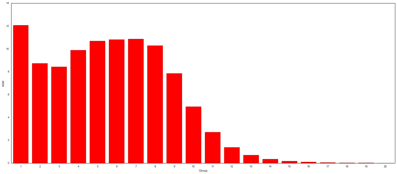
Background: “Total” Series

background_total

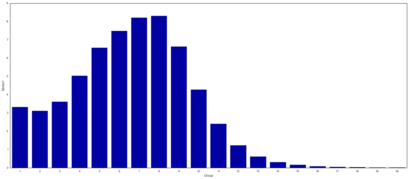
Overlay: “Bottom” Series

bottom_plot

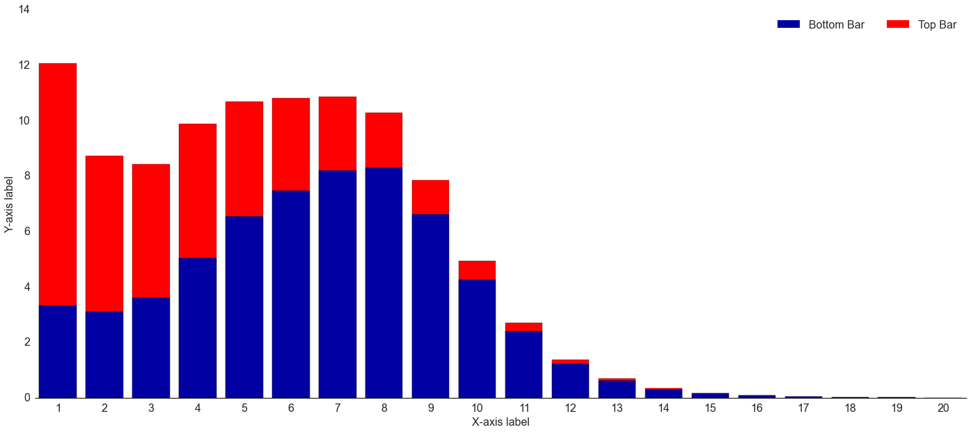
End Result: Stacked Bar Chart

Running the code in the same IPython Notebook cell results in the following chart (download chart data):

stacked-bar-seaborn

1
2
3
4
5
6
7
8
9
10
11
12
13
14
15
16
17
18
19
20
21
22
23
24
25
26
27
28
29
30
31
32
33
34
35
import pandas as pd
from matplotlib import pyplot as plt
import matplotlib as mpl
import seaborn as sns
%matplotlib inline

#Read in data & create total column
stacked_bar_data = pd.read_csv("C:\stacked_bar.csv")
stacked_bar_data["total"] = stacked_bar_data.Series1 + stacked_bar_data.Series2

#Set general plot properties
sns.set_style("white")
sns.set_context({"figure.figsize": (24, 10)})

#Plot 1 - background - "total" (top) series
sns.barplot(x = stacked_bar_data.Group, y = stacked_bar_data.total, color = "red")

#Plot 2 - overlay - "bottom" series
bottom_plot = sns.barplot(x = stacked_bar_data.Group, y = stacked_bar_data.Series1, color = "#0000A3")


topbar = plt.Rectangle((0,0),1,1,fc="red", edgecolor = 'none')
bottombar = plt.Rectangle((0,0),1,1,fc='#0000A3',  edgecolor = 'none')
l = plt.legend([bottombar, topbar], ['Bottom Bar', 'Top Bar'], loc=1, ncol = 2, prop={'size':16})
l.draw_frame(False)

#Optional code - Make plot look nicer
sns.despine(left=True)
bottom_plot.set_ylabel("Y-axis label")
bottom_plot.set_xlabel("X-axis label")

#Set fonts to consistent 16pt size
for item in ([bottom_plot.xaxis.label, bottom_plot.yaxis.label] +
             bottom_plot.get_xticklabels() + bottom_plot.get_yticklabels()):
    item.set_fontsize(16)

Don’t Overthink Things!

In the end, creating a stacked bar chart in Seaborn took me 4 hours to mess around trying everything under the sun, then 15 minutes once I remembered what a stacked bar chart actually represents. Hopefully this will save someone else from my same misery.

Download chart data

  • RSiteCatalyst Version 1.4.16 Release Notes
  • Using RSiteCatalyst With Microsoft PowerBI Desktop
  • RSiteCatalyst Version 1.4.14 Release Notes
  • RSiteCatalyst Version 1.4.13 Release Notes
  • RSiteCatalyst Version 1.4.12 (and 1.4.11) Release Notes
  • Self-Service Adobe Analytics Data Feeds!
  • RSiteCatalyst Version 1.4.10 Release Notes
  • WordPress to Jekyll: A 30x Speedup
  • Bulk Downloading Adobe Analytics Data
  • Adobe Analytics Clickstream Data Feed: Calculations and Outlier Analysis
  • Adobe: Give Credit. You DID NOT Write RSiteCatalyst.
  • RSiteCatalyst Version 1.4.8 Release Notes
  • Adobe Analytics Clickstream Data Feed: Loading To Relational Database
  • Calling RSiteCatalyst From Python
  • RSiteCatalyst Version 1.4.7 (and 1.4.6.) Release Notes
  • RSiteCatalyst Version 1.4.5 Release Notes
  • Getting Started: Adobe Analytics Clickstream Data Feed
  • RSiteCatalyst Version 1.4.4 Release Notes
  • RSiteCatalyst Version 1.4.3 Release Notes
  • RSiteCatalyst Version 1.4.2 Release Notes
  • Destroy Your Data Using Excel With This One Weird Trick!
  • RSiteCatalyst Version 1.4.1 Release Notes
  • Visualizing Website Pathing With Sankey Charts
  • Visualizing Website Structure With Network Graphs
  • RSiteCatalyst Version 1.4 Release Notes
  • Maybe I Don't Really Know R After All
  • Building JSON in R: Three Methods
  • Real-time Reporting with the Adobe Analytics API
  • RSiteCatalyst Version 1.3 Release Notes
  • Adobe Analytics Implementation Documentation in 60 Seconds
  • RSiteCatalyst Version 1.2 Release Notes
  • Clustering Search Keywords Using K-Means Clustering
  • RSiteCatalyst Version 1.1 Release Notes
  • Anomaly Detection Using The Adobe Analytics API
  • (not provided): Using R and the Google Analytics API
  • My Top 20 Least Useful Omniture Reports
  • For Maximum User Understanding, Customize the SiteCatalyst Menu
  • Effect Of Modified Bounce Rate In Google Analytics
  • Adobe Discover 3: First Impressions
  • Using Omniture SiteCatalyst Target Report To Calculate YOY growth
  • ODSC webinar: End-to-End Data Science Without Leaving the GPU
  • PyData NYC 2018: End-to-End Data Science Without Leaving the GPU
  • Data Science Without Leaving the GPU
  • Getting Started With OmniSci, Part 2: Electricity Dataset
  • Getting Started With OmniSci, Part 1: Docker Install and Loading Data
  • Parallelizing Distance Calculations Using A GPU With CUDAnative.jl
  • Building a Data Science Workstation (2017)
  • JuliaCon 2015: Everyday Analytics and Visualization (video)
  • Vega.jl, Rebooted
  • Sessionizing Log Data Using data.table [Follow-up #2]
  • Sessionizing Log Data Using dplyr [Follow-up]
  • Sessionizing Log Data Using SQL
  • Review: Data Science at the Command Line
  • Introducing Twitter.jl
  • Code Refactoring Using Metaprogramming
  • Evaluating BreakoutDetection
  • Creating A Stacked Bar Chart in Seaborn
  • Visualizing Analytics Languages With VennEuler.jl
  • String Interpolation for Fun and Profit
  • Using Julia As A "Glue" Language
  • Five Hard-Won Lessons Using Hive
  • Using SQL Workbench with Apache Hive
  • Getting Started With Hadoop, Final: Analysis Using Hive & Pig
  • Quickly Create Dummy Variables in a Data Frame
  • Using Amazon EC2 with IPython Notebook
  • Adding Line Numbers in IPython/Jupyter Notebooks
  • Fun With Just-In-Time Compiling: Julia, Python, R and pqR
  • Getting Started Using Hadoop, Part 4: Creating Tables With Hive
  • Tabular Data I/O in Julia
  • Hadoop Streaming with Amazon Elastic MapReduce, Python and mrjob
  • A Beginner's Look at Julia
  • Getting Started Using Hadoop, Part 3: Loading Data
  • Innovation Will Never Be At The Push Of A Button
  • Getting Started Using Hadoop, Part 2: Building a Cluster
  • Getting Started Using Hadoop, Part 1: Intro
  • Instructions for Installing & Using R on Amazon EC2
  • Video: SQL Queries in R using sqldf
  • Video: Overlay Histogram in R (Normal, Density, Another Series)
  • Video: R, RStudio, Rcmdr & rattle
  • Getting Started Using R, Part 2: Rcmdr
  • Getting Started Using R, Part 1: RStudio
  • Learning R Has Really Made Me Appreciate SAS