Edit 10/1/2018: When I wrote this blog post, the company and product were named MapD. I’ve changed the title to reflect the new company name, but left the MapD references below to hopefully avoid confusion
In my previous MapD post, I loaded electricity data into MapD Community Edition, intentionally ignoring the what of the data to keep that post from being too overwhelming. Now let’s take a step back and explain the dataset, show how to format the data using Python that was loaded into MapD, then use the MapD Immerse UI to build a simple dashboard.
PJM Metered Load Data
I started off my career at PJM doing long-term electricity demand forecasting, to help power engineers do transmission line studies for reliability and to support expansion of the electrical grid in the U.S. Because PJM is a quasi-government agency, they provide over 25 years of hourly electricity usage for the Eastern and Central U.S., both in aggregate and by local power region (roughly, the local power company territories).
However, just because the data is available doesn’t mean it’s convenient, and unfortunately, the data are stored as Excel spreadsheets. This is easily remedied using pandas (v0.22.0, python3.6):
1
2
3
4
5
6
7
8
9
10
11
12
13
14
15
16
17
18
19
20
21
22
23
24
25
26
27
28
29
30
31
32
33
34
35
36
37
38
39
40
41
42
43
44
45
46
47
48
49
50
51
52
import os
import pandas as pd

#change to directory with files for convenience
os.chdir("~/electricity_data")

#first sheet in workbook contains all info for years 1993-1999
df1993_1999 = [pd.read_excel(str(x) + "-hourly-loads.xls", usecols = "A:Z") for x in range(1993,1999)]

#melt, append df1993-df1999 together
df_melted = pd.DataFrame()
for x in df1993_1999:
    x.columns = df1993_1999[1].columns.tolist()
    x_melt = pd.melt(x, id_vars=['ACTUAL_DATE', 'ZONE_NAME'], var_name = "HOUR_ENDING", value_name = "MW")
    df_melted = df_melted.append(x_melt)

#multiple sheets to concatenate
#too much variation for a one-liner
d2000 = pd.read_excel("2000-hourly-loads.xls", sheet_name = [x for x in range(2,17)], usecols = "A:Z")
d2001 = pd.read_excel("2001-hourly-loads.xls", sheet_name = None, usecols = "A:Z")
d2002 = pd.read_excel("2002-hourly-loads.xls", sheet_name = [x for x in range(1,18)], usecols = "A:Z")
d2003 = pd.read_excel("2003-hourly-loads.xls", sheet_name = [x for x in range(1,19)], usecols = "A:Z")
d2004 = pd.read_excel("2004-hourly-loads.xls", sheet_name = [x for x in range(2,24)], usecols = "A:Z")
d2005 = pd.read_excel("2005-hourly-loads.xls", sheet_name = [x for x in range(2,27)], usecols = "A:Z")
d2006 = pd.read_excel("2006-hourly-loads.xls", sheet_name = [x for x in range(3,29)], usecols = "A:Z")
d2007 = pd.read_excel("2007-hourly-loads.xls", sheet_name = [x for x in range(3,29)], usecols = "A:Z")
d2008 = pd.read_excel("2008-hourly-loads.xls", sheet_name = [x for x in range(3,29)], usecols = "A:Z")
d2009 = pd.read_excel("2009-hourly-loads.xls", sheet_name = [x for x in range(3,29)], usecols = "A:Z")
d2010 = pd.read_excel("2010-hourly-loads.xls", sheet_name = [x for x in range(3,29)], usecols = "A:Z")
d2011 = pd.read_excel("2011-hourly-loads.xls", sheet_name = [x for x in range(3,32)], usecols = "A:Z")
d2012 = pd.read_excel("2012-hourly-loads.xls", sheet_name = [x for x in range(3,33)], usecols = "A:Z")
d2013 = pd.read_excel("2013-hourly-loads.xls", sheet_name = [x for x in range(3,34)], usecols = "A:Z")
d2014 = pd.read_excel("2014-hourly-loads.xls", sheet_name = [x for x in range(3,34)], usecols = "A:Z")
d2015 = pd.read_excel("2015-hourly-loads.xls", sheet_name = [x for x in range(3,40)], usecols = "B:AA")
d2016 = pd.read_excel("2016-hourly-loads.xls", sheet_name = [x for x in range(3,40)], usecols = "B:AA")
d2017 = pd.read_excel("2017-hourly-loads.xls", sheet_name = [x for x in range(3,42)], usecols = "B:AA")
d2018 = pd.read_excel("2018-hourly-loads.xls", sheet_name = [x for x in range(3,40)], usecols = "B:AA")

#loop over dataframes, read in matrix-formatted data, melt to normalized form
for ord in [d2000, d2001, d2002, d2003, d2004, d2005, d2006, d2007, d2008, d2009, d2010,
            d2011, d2012, d2013, d2014, d2015, d2016, d2017, d2018]:

    for key in ord:
        temp = ord[key]
        temp.columns = df1993_1999[1].columns.tolist() #standardize column names
        temp["ACTUAL_DATE"] = pd.to_datetime(temp["ACTUAL_DATE"]) #force datetime, excel reader wonky
        df_melted = df_melted.append(pd.melt(temp, id_vars=['ACTUAL_DATE', 'ZONE_NAME'], var_name = "HOUR_ENDING", value_name = "MW"))

#(4941384, 4)
#130MB as CSV
#remove any dates that are null, artifacts from excel reader
df_melted[pd.notnull(df_melted["ACTUAL_DATE"])].to_csv("hourly_loads.csv", index=False)
The code is a bit verbose, if only because I didn’t want to spend time to figure out how to programmatically determine how many tabs each workbook has. But the concept is the same each time: read an Excel file, get the data into a dataframe, then convert the data to long form. So instead of having 26 columns (Date, Zone, Hr1-Hr24), we have 4 columns, which is quite frequently a more convenient way to access the data (especially when using SQL).
The final statement writes out a CSV of approximately 4MM rows, the same dataset that was loaded using mapdql in the first post.
Top 10 Usage Days By Season
One of the metrics I used to monitor as part of my job was the top 5/top 10 peak electricity use days per Summer (high A/C usage) and Winter (electric space heating) seasons. Back in those days, I used to use SAS against an enterprise database and the results would come back eventually…
Obviously, it’s not a fair comparison to compare today’s GPUs vs. late ’90s enterprise databases in terms of performance, but back then it did take a non-trivial amount of effort to run this query to keep the report updated. With MapD, I can do the same report in ~100ms:
1
2
3
4
5
6
7
8
9
10
11
12
13
14
15
16
17
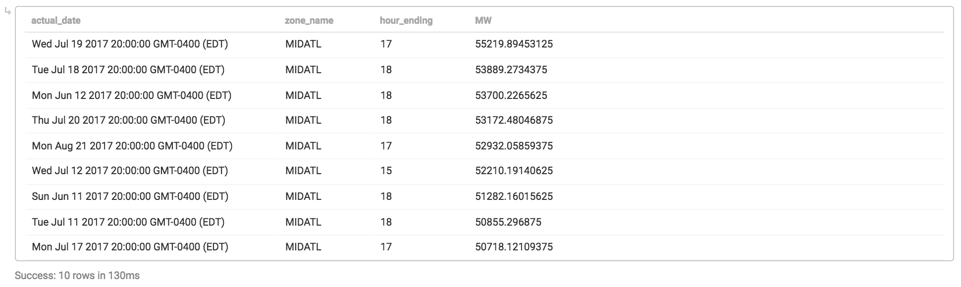
--MapD doesn't currently support window functions, so need to precalculate maximum by day
with qry as (select
actual_date,
zone_name,
max(MW) as daily_max_usage
from hourly_loads
where zone_name = 'MIDATL' and actual_date between '2017-06-01' and '2017-09-30'
group by 1,2)
select
hl.actual_date,
hl.zone_name,
hl.hour_ending,
hl.MW
from hourly_loads as hl
inner join qry on qry.actual_date = hl.actual_date and qry.daily_max_usage = hl.mw
order by daily_max_usage desc
limit 10;
The thing about returning an answer in 100ms or so is that its fast enough where calling these results from a webpage/dashboard would be very responsive; that’s where MapD Immerse comes in.
Building A Dashboard Using MapD Immerse
Rather than copy/pasting the query in and running it, it’s pretty easy to build an automated report using the Immerse dashboard builder. I’m limited to a single data source because I’m using MapD Community Edition, but in just a few minutes I was able to create the following dashboard:
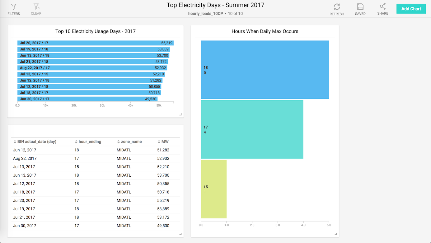
I took the query from above and built a view to encapsulate the query, so I didn’t have to worry about the with statement or joins, I could just use the view as if the results were pre-calculated. From there, adding in a results table and two bar charts was fairly quick (in the same drag-and-drop style of Tableau or other BI/reporting tools).
While this dashboard is pretty rudimentary in its design, were this data source set up as real-time using Apache Kafka or similar, this chart would always be up-to-date for use on a TV screen or as a browser bookmark without any additional data or web engineering.
Obviously, many dashboarding tools exist, but its important to note that no pre-aggregation or column indexing or other standard database performance tricks are being employed (outside of specialized hardware and fast GPU RAM caching). Even with 10 dashboard tiles updating serially 100ms at a time, you are still in the 1-2s page load time, on par with the fastest-loading dynamic webpages on the internet.
Programmatic analytics using pymapd
While dashboarding can be very effective for keeping senior management up-to-date, the real value of data is unlocked with more in-depth analytics and segmentation. In my next blog post, I’ll cover how to access MapD using pymapd in Python, doing more advanced visualizations and maybe even some machine learning…