A couple of weeks ago, Twitter open-sourced their BreakoutDetection package for R, a package designed to determine shifts in time-series data. The Twitter announcement does a great job of explaining the main technique for detection (E-Divisive with Medians), so I won’t rehash that material here. Rather, I wanted to see how this package works relative to the anomaly detection feature in the Adobe Analytics API, which I’ve written about previously.
Getting Time-Series Data Using RSiteCatalyst
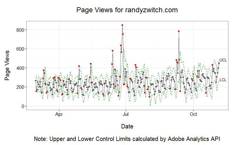
To use a real-world dataset to evaluate this package, I’m going to use roughly ten months of daily pageviews generated from my blog. The hypothesis here is that if the BreakoutDetection package works well, it should be able to detect the boundaries around when I publish a blog post (of which the dates I know with certainty) and when articles of mine get shared on sites such as Reddit. From past experience, I get about a 3-day lift in pageviews post-publishing, as the article gets tweeted out, published on R-Bloggers or JuliaBloggers and shared accordingly.
Here’s the code to get daily pageviews using RSiteCatalyst (Adobe Analytics):
1
2
3
4
5
6
7
8
9
10
11
12
13
14
15
16
17
18
#Installing BreakoutDetection packageinstall.packages("devtools")devtools::install_github("twitter/BreakoutDetection")library(BreakoutDetection)library("RSiteCatalyst")SCAuth("company","secret")#Get pageviews for each day in 2014pageviews_2014<-QueueOvertime('report-suite',date.from='2014-02-24',date.to='2014-11-05',metric='pageviews',date.granularity='day')#v1.0.1 of package requires specific column names and dataframe formatformatted_df<-pageviews_2014[,c("datetime","pageviews")]names(formatted_df)<-c("timestamp","count")
One thing to notice here is that BreakoutDetection requires either a single R vector or a specifically formatted data frame. In this case, because I have a timestamp, I use lines 17-18 to get the data into the required format.
BreakoutDetection - Default Example
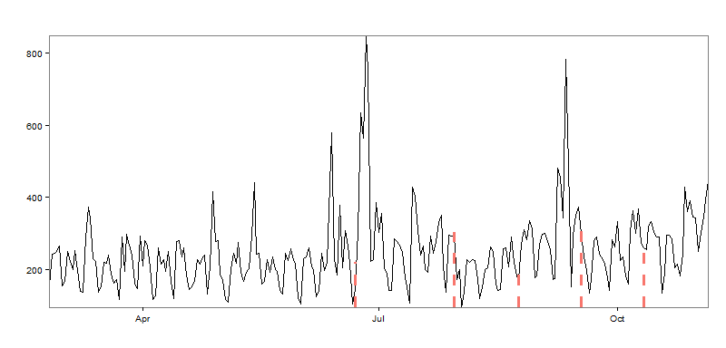
In the Twitter announcement, they provide an example, so let’s evaluate those defaults first:
In order to validate my hypothesis, the package would need to detect 12 ‘breakouts’ or so, as I’ve published 12 blog posts during the sample time period. Mentally drawing lines between the red boundaries, we can see three definitive upward mean shifts, but far fewer than the 12 I expected.
BreakoutDetection - Modifying The Parameters
Given that the chart above doesn’t fit how I think my data are generated, we can modify two main parameters: beta and min.size. From the documentation:
beta: A real numbered constant used to further control the amount of penalization. This is the default form of penalization, if neither (or both) beta or (and) percent are supplied this argument will be used. The default value is beta=0.008.
min.size: The minimum number of observations between change points
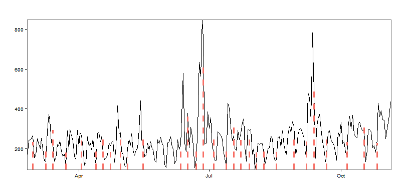
The first parameter I’m going to experiment with is min.size, because it requires no in-depth knowledge of the EDM technique! The value used in the first example was 24 (days) between intervals, which seems extreme in my case. It’s reasonable that I might publish a blog post per week, so let’s back that number down to 5 and see how the result changes:
With 17 predicted intervals, we’ve somewhat overshot the number of blog posts mark. Not that the package is wrong per se; the boundaries are surrounding many of the spikes in the data, but perhaps having this many breakpoints isn’t useful from a monitoring standpoint. So setting the min.size parameter somewhere between 5 and 24 points would give us more than 3 breakouts, but less than 17. There is also the beta parameter that can be played with, but I’ll leave that as an exercise for another day.
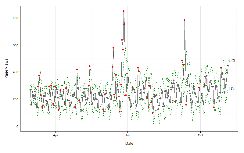
Even though the idea of both techniques are similar, it’s clear that the two methods don’t quite represent the same thing. In the case of the Adobe Analytics Anomaly Detection, it’s looking datapoint-by-datapoint, with a smoothing model built from the prior 35 points. If a point exceeds the upper- or lower-control limits, then it’s an anomaly, but not necessarily indicative of a true level shift like the BreakoutDetection package is measuring.
Conclusion
The BreakoutDetection package is definitely cool, but it is a bit raw, especially the default graphics. But the package definitely does work, as evidenced by how well it put boundaries around the traffic spikes when I set the min.size parameter equal to five.
Additionally, I tried to read more about the underlying methodology, but the only references that come up in Google seem to be references to the R package itself! I wish I had a better feeling for how the beta parameter influences the graph, but I guess that will come over time as I use the package more. But I’m definitely glad that Twitter open-sourced this package, as I’ve often wondered about how to detect level shifts in a more operational setting, and now I have a method to do so.
In my prior post on visualizing website structure using network graphs, I referenced that network graphs showed the pairwise relationships between two pages (in a bi-directional manner). However, if you want to analyze how your visitors are pathing through your site, you can visualize your data using a Sankey chart.
Visualizing Single Page-to-Next Page Pathing
Most digital analytics tools allow you to visualize the path between pages. In the case of Adobe Analytics, the Next Page Flow diagram is limited to 10 second-level branches in the visualization. However, the Adobe Analytics API has no such limitation, and as such we can use RSiteCatalyst to create the following visualization (GitHub Gist containing R code):
The data processing for this visualization is near identical to the network diagrams. We can use QueuePathing() from RSiteCatalyst to download our pathing data, except in this case, I specified an exact page name as the first level of the pathing pattern instead of using the ::anything:: operator. In all Sankey charts created by d3Network, you can hover over the right-hand side nodes to see the values (you can also drag around the nodes on either side if you desire!). It’s pretty clear from this diagram that I need to do a better job retaining my visitors, as the most common path from this page is to leave. 🙁
Many-to-Many Page Pathing
The example above picks a single page related to Hadoop, then shows how my visitors continue through my site; sometimes, they go to other Hadoop pages, some view Data Science related content or any number of other paths. If we want, however, we can visualize how all visitors path through all pages. Like the force-directed graph, we can get this information by using the ("::anything::", "::anything::") path pattern with QueuePathing():
#Multi-page pathinglibrary("d3Network")library("RSiteCatalyst")#### AuthenticationSCAuth("name","secret")#### Get All Possible Paths with ("::anything::", "::anything::")pathpattern<-c("::anything::","::anything::")next_page<-QueuePathing("zwitchdev","2014-01-01","2014-08-31",metric="pageviews",element="page",pathpattern,top=50000)#Optional step: Cleaning my pagename URLs to remove to domain for claritynext_page$step.1<-sub("http://randyzwitch.com/","",next_page$step.1,ignore.case=TRUE)next_page$step.2<-sub("http://randyzwitch.com/","",next_page$step.2,ignore.case=TRUE)#Filter out Entered Site and duplicate rows, >120 for chart legibilitylinks<-subset(next_page,count>=120&step.1!="Entered Site")#Get unique values of page name to create nodes df#Create an index value, starting at 0nodes<-as.data.frame(unique(c(links$step.1,links$step.2)))names(nodes)<-"name"nodes$nodevalue<-as.numeric(row.names(nodes))-1#Convert string to numeric nodeidlinks<-merge(links,nodes,by.x="step.1",by.y="name")names(links)<-c("step.1","step.2","value","segment.id","segment.name","source")links<-merge(links,nodes,by.x="step.2",by.y="name")names(links)<-c("step.2","step.1","value","segment.id","segment.name","source","target")#Create next page Sankey chartd3output="~/Desktop/sankey_all.html"d3Sankey(Links=links,Nodes=nodes,Source="source",Target="target",Value="value",NodeID="name",fontsize=12,nodeWidth=50,file=d3output,width=750,height=700)
Running the code above provides the following visualization:
For legibility purposes, I’m only plotting paths that occur more than 120 times. But given a large enough display, it would be possible to visualize all valid combinations of paths.
One thing to keep in mind is that with the d3.js library, there is a weird hiccup where if your dataset contains “duplicate” paths such that both Source -> Target & Target -> Source exists, d3.js will go into an infinite loop/not show any visualization. My R code doesn’t provide a solution to this issue, but it should be trivial to remove these “duplicates” should they arise in your dataset.
Interpretation
Unlike the network graphs, Sankey Charts are fairly easy to understand. The “worst” path on my site in terms of keeping visitors on site is where I praised Apple for fixing my MacBook Pro screen out-of-warranty. The easy explanation for this poor performance is that this article attracts people who aren’t really my target audience in data science, but looking for information about getting THEIR screens fixed. If I wanted to engage these readers more, I guess I would need to write more Apple-related content.
To the extent there are multi-stage paths, these tend to be Hadoop and Julia-related content. This makes sense as both technologies are fairly new, I have a lot more content in these areas, and especially in the case of Julia, I’m one of the few people writing practical content. So I’m glad to see I’m achieving some level of success in these areas.
The other day I was having a heck of a time trying to figure out how to make a stacked bar chart in Seaborn. But in true open-source/community fashion, I ended up getting a response from the creator of Seaborn via Twitter:
@randyzwitch I don't really like stacked bar charts, I'd suggest maybe using pointplot / factorplot with kind=point
So there you go. I don’t want to put words in Michael’s mouth, but if he’s not a fan, then it sounded like it was up to me to find my own solution if I wanted a stacked bar chart. I hacked around on the pandas plotting functionality a while, went to the matplotlib documentation/example for a stacked bar chart, tried Seaborn some more and then it hit me…I’ve gotten so used to these amazing open-source packages that my brain has atrophied! Creating a stacked bar chart is SIMPLE, even in Seaborn (and even if Michael doesn’t like them 🙂 )
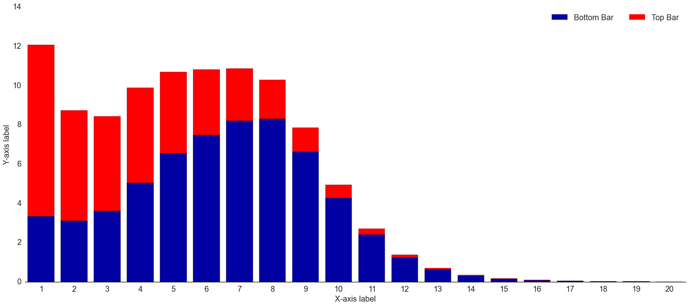
Stacked Bar Chart = Sum of Two Series
In trying so hard to create a stacked bar chart, I neglected the most obvious part. Given two series of data, Series 1 (“bottom”) and Series 2 (“top”), to create a stacked bar chart you just need to create:
1
Series3=Series1+Series2
Once you have Series 3 (“total”), then you can use the overlay feature of matplotlib and Seaborn in order to create your stacked bar chart. Plot “total” first, which will become the base layer of the chart. Because the total by definition will be greater-than-or-equal-to the “bottom” series, once you overlay the “bottom” series on top of the “total” series, the “top” series will now be stacked on top:
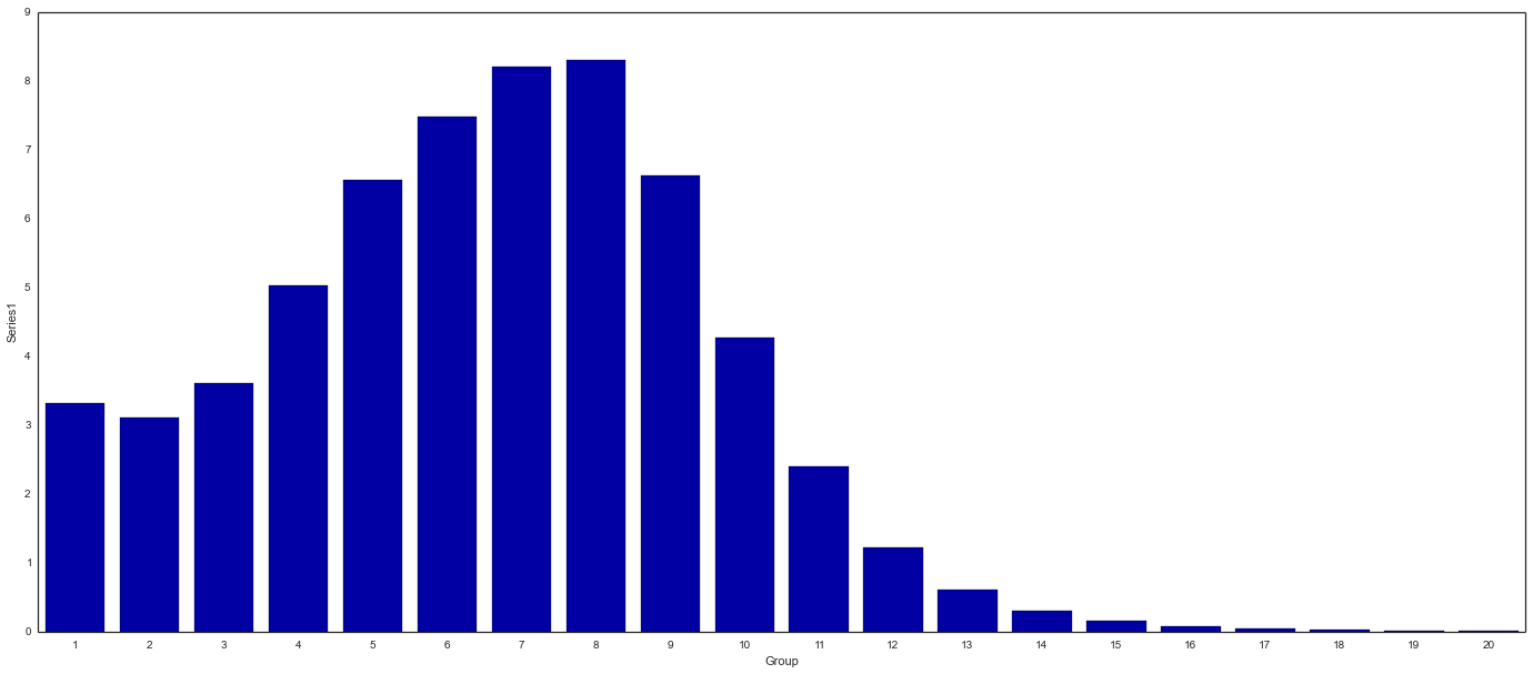
Background: “Total” Series
Overlay: “Bottom” Series
End Result: Stacked Bar Chart
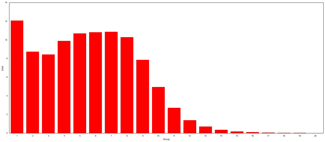
Running the code in the same IPython Notebook cell results in the following chart (download chart data):
importpandasaspdfrommatplotlibimportpyplotaspltimportmatplotlibasmplimportseabornassns%matplotlibinline#Read in data & create total column
stacked_bar_data=pd.read_csv("C:\stacked_bar.csv")stacked_bar_data["total"]=stacked_bar_data.Series1+stacked_bar_data.Series2#Set general plot properties
sns.set_style("white")sns.set_context({"figure.figsize":(24,10)})#Plot 1 - background - "total" (top) series
sns.barplot(x=stacked_bar_data.Group,y=stacked_bar_data.total,color="red")#Plot 2 - overlay - "bottom" series
bottom_plot=sns.barplot(x=stacked_bar_data.Group,y=stacked_bar_data.Series1,color="#0000A3")topbar=plt.Rectangle((0,0),1,1,fc="red",edgecolor='none')bottombar=plt.Rectangle((0,0),1,1,fc='#0000A3',edgecolor='none')l=plt.legend([bottombar,topbar],['Bottom Bar','Top Bar'],loc=1,ncol=2,prop={'size':16})l.draw_frame(False)#Optional code - Make plot look nicer
sns.despine(left=True)bottom_plot.set_ylabel("Y-axis label")bottom_plot.set_xlabel("X-axis label")#Set fonts to consistent 16pt size
foritemin([bottom_plot.xaxis.label,bottom_plot.yaxis.label]+bottom_plot.get_xticklabels()+bottom_plot.get_yticklabels()):item.set_fontsize(16)
Don’t Overthink Things!
In the end, creating a stacked bar chart in Seaborn took me 4 hours to mess around trying everything under the sun, then 15 minutes once I remembered what a stacked bar chart actually represents. Hopefully this will save someone else from my same misery.