A few months back, Justin Cutroni posted on his blog some jQuery code that modifies how Google Analytics tracks content. Specifically, the code snippet changes how bounce rate and time on site are calculated, creates a custom variable to classify whether visitors are “Readers” vs. “Scanners” and adds some Google Analytics events to track how far down the page visitors are reading.
Given that this blog is fairly technical and specific in nature, I was interested in seeing how the standard Google Analytics metrics would change if I implemented this code and how my changes compared to Justin’s. I’ve always suspected my bounce rate in the 80-90% range didn’t really represent whether people were finding value in my content. The results were quite surprising to say the least!
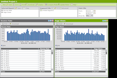
Bounce Rate - Dropped through the floor!

Starting April 24th, Bounce Rate drops considerably!
As expected, implementing the content tracking code caused a significant drop in bounce rate, due to counting scrolling as a page “interaction” using Google Analytics events. Thus, the definition of bounce rate changed from single page view visits to visitors that don’t interact with the page by scrolling at least 150 pixels.
In the case of my blog, the bounce rate dropped from 80-90% to 5-15%! This result tells me that people who arrive on-site aren’t arriving by accident, that they are specifically interested in the content. Sure, I could’ve validated this using incoming search term research, but this provides a second data point. The content I provide not only ranks well in Google, but once on-site also causes readers to want to see what the article contains.
Readers vs. Scanners
Even with the bounce rate drop above, I really don’t get a good feeling about whether people are actually reading the content. Sure, people are scrolling 150px or more, but due to the ADHD nature of the web, plenty of people scroll without reading just to see what else is on the page! That’s where the “Readers vs. Scanners” report comes in:

62% of visits only scan instead of read - Need to do better here!
The report above shows that only 38% of visits to the site actually READ an article, rather than just quickly scroll. This is disappointing, but now that I’ve got the information being tracked, I can set up a goal in Google Analytics with the aim of improving the ratio of actual readers vs. quick scrollers.
Average Visit Duration - Still useless
Like the bounce rate definition change above, average visit duration and average time on page also change definitions when using the jQuery content tracking code. Given that Google Analytics calculates time metrics by measuring the time between page views or events, by adding more events on the page, all time on site metrics have to increase (by definition).

Hard to see because of the Y-axis, but Avg. Visit Duration increases significantly as well.
That said, average visit duration is still a pretty useless metric, given that an increase/decrease in this metric doesn’t immediately tell you “good” or “bad”…
Content Consumption “Funnel”
Finally, the last change that occurs when you implement the content tracking code is a series of Google Analytics events that measure how far down the page visitors are actually seeing. This report, in combination with the Readers vs. Scanners report, helps understand reader engagement better than any generic “Time on Site” metric can do.

From this report, I can see that of the 2,102 articles loaded:
- 89.4% of the articles have a “StartReading” event fired
- 89.8% of those who start to read an article reach the bottom of the article.
- 19.7% of those who reach the end of the article scroll past the comments to reach the true end of page
The first metric above is analogous to subtracting the bounce rate from 1, the percentage of articles viewed that don’t bounce. The second metric (complete articles seen), with a success rate of 89.8% is ripe for segmentation. I stated above that only 38% actually READ an article, so segmenting the above report by “Readers” vs. “Scanners” will surely lower the success rate in the “Readers” population.
Finally, that <20% actually touch the true bottom of page is surprising to me, since this blog really doesn’t get many comments! If there were thousands of comments and the pages were really long, ok, no one sees the bottom…but here? I’ll have to think about this a bit.
Great update to Google Analytics default settings!
Overall, my impression of the jQuery code snippet developed by Justin and others is that it is extremely useful in understand interaction of visitors to content sites. The only downside I see here is that it changes the definition of bounce rate within Google Analytics, which could be confusing to others who 1) aren’t aware of the code snippet running on-site or 2) don’t quite understand the subtleties of Google Analytics implementation with respect to Events and the non-interaction setting.
But since this is my personal blog, I don’t need to worry about others mis-interpreting my Google Analytics data, so I’m going to keep this functionality installed!
Update 7/25/12: Google Analytics published a similar method to the one described above, using “setTimeout” to modify bounce rate based solely on time-on-page.

With yesterday’s code release, Omniture Adobe released version 3 of their “Discover” tool, THE way to perform web analysis within the Adobe Digital Marketing Suite. While SiteCatalyst has its place for basic reporting, to really dig deep into your data for actionable insights there’s no substitute to using Discover.
But as with every product overhaul, there is the potential to change things that users liked and while not make enough improvement to excite the user base…but luckily, that’s not the case with Discover 3. Here’s how I see the new features and design changes.
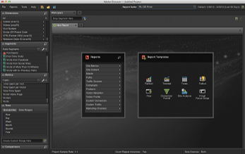
New “Darth Vader” interface

"Ooh, tough looking. Just like hardcore web analysts!"
Of all the cool things about Discover 3, I’m not sure the new color palette is one of them. Several reasons were given by Adobe for choosing the carbon colored interface, from trying to match analyst’s personalities (yuck!), reducing eye strain (ok), and consistent branding (eh). Of the three, I’ll say that reducing eye strain is a worthy goal, although Discover 3 never struck me as “eye-burning” in the past.
Maybe I’ll grow to like it, but right now, it seems really dark. The light gray text on dark gray background needs a bit more contrast, and in general, the interface feels kinda depressing.
Calendars - No more #^%&$ sliders!
Now we’re getting somewhere. The slider interface in Discover 2 never made sense to me. You pick your time period up front, open a report, and then to modify the time period within an individual report you needed to move a bunch of jerky sliders around.
In Discover 3, we now have the same style calendar interface as SiteCatalyst. Makes sense from a consistency standpoint within the Adobe Digital Marketing Suite and a general UX standpoint. Pointing at two dates on the calendar is way easier and faster than moving endpoints of a slider!
Heterogeneous Pathing
This is so completely badass and the best new feature of Discover 3. No longer are you confined to a fallout report that only includes just one Omniture variable type. So if I want to do a funnel that measures visits containing a few different pages, then triggering a Facebook ‘Like’ event, a Cart Open, then an Exit Link, I can now do so!
You can also switch from “Visit-level” to “Visitor-level” on the fly, which can also be useful depending on how your view your business. Some people like to think about every visit being an opportunity to convert on-site, whereas Avinash advocates in his Web Analytics 2.0 book that using Visitors as the denominator for conversion rate is the proper thought model. I won’t weigh in on the difference in this post, but it’s cool that we can now change back-and-forth to see what the differences in the data are.
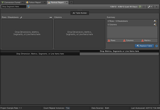
Table Builder

Nice drag-and-drop options, very PivotTable like
Finally, the last really obvious difference between Discover 2 and Discover 3 is the table builder while using ranked reports. Like the eye-strain issue talked about above, the amount of time that it took for reports to build never really seemed like an issue to me. Perhaps that’s the SAS programmer side of me that often waits hours to return a result of a complex set of commands.
But now that I’ve used the table builder, it’s definitely an improvement on how data tables get built. You get to specify each element you want in the table first, THEN the data gets retrieved. It may sound like a small change, but when you already know what you want, not having to wait for the table to build while you keep dragging in metrics does feel like it’s way faster to get the table you are looking for.
Adobe Discover 3 - Definitely an improvement
There are probably 20 other things I haven’t noticed yet in the new Discover 3 interface, but from what I have used so far, this is a great upgrade in functionality! It feels faster to get things completed with the table builder and the new pathing functionality across all variable types is a long time coming. Now, if only there was a different color palette I could choose, it’d be perfect…maybe something like this?

You should prefer green, not carbon.
Of the hundreds of stock reports and capabilities present within Adobe (Omniture) SiteCatalyst, calculating year-over-year growth isn’t the easiest thing to do. And while conversion reports (eVars) have the “Compare Dates” functionality within the calendar menu, we can’t quickly plot the difference between two time periods within a dashboard. This is where the Omniture SiteCatalyst Target report comes in handy.
Setting up your “Goal”
Within the Omniture Knowledge Base KB2153, I think Omniture does a disservice by stating:
Targets are quantifiable goals that you can place within the SiteCatalyst interface and compare against reports.
While this is a true statement, I think one of the reasons that the Omniture SiteCatalyst Target report isn’t more widely used is that it doesn’t have to be a future “goal” per se, any set numbers can be used. When last year’s numbers are used, the report becomes a year-over-year comparison!
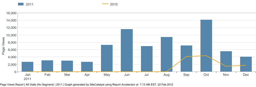
For this example, I’m going to be comparing page views year-over-year. Here’s what the page views summary by month looks like for 2011:

Omniture Page Views Report - 2011
Using this report to set a year-over-year target, we can see the early months are in the few thousands of page views, increasing to 12,000 -14,000 later in the year.

Monthly Target Setup within Omniture Interface
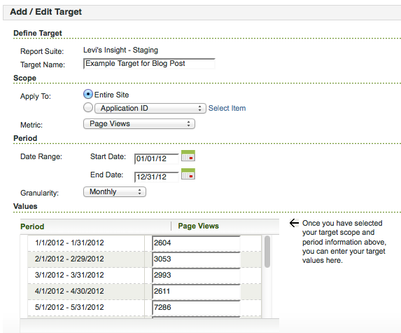
Assuming you are using Omniture SiteCatalyst v15, you set up a Target report under Favorites -> Targets -> Manage Targets, then choose Add New once you’re in the Targets menu. I’ll be setting up a monthly target for Page Views, so I’ll just type it in instead of using the file upload capability. For this example, we want to apply this target to “Entire Site” for the “Page Views” Metric. The date range will be all of 2012, with “Monthly” granularity. This will give you 12 boxes to type in the 2011 Page View results, and once we hit “Ok” to save, we’ll have our year-over-year report set up.
Getting the Year-over-Year graph within Omniture
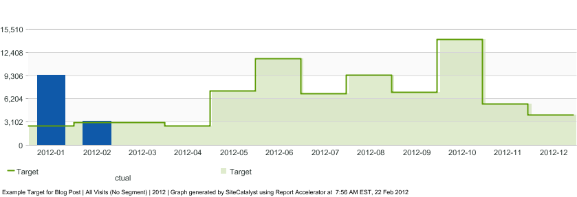
Showing the results of our newly created Target report is as easy as going to Favorites -> Targets, then choosing the appropriate Target. By default, the report will show like a normal metric report, with a green overlay for your targets:

Default view of Omniture SiteCatalyst Target report
The above report shows that Page Views for January 2012 are well above our January 2011 “Target” and that February has already exceeded the goal as well…which is great since we’ve got 7 more days left in the month!
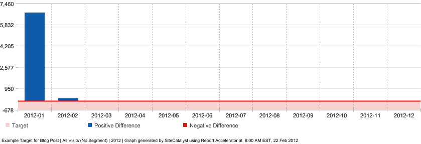
If we want to show the year-over-year delta, however, we can choose the “Variance” report option at the top of the graph. Doing so will show the following report:

Omniture SiteCatalyst Target Report - "Variance" option
By placing this report in a dashboard, we can quickly evaluate whether Page Views have grown by month year-over-year. It’s disappointing that the only graph option Adobe provides is the raw metric higher/lower than the target instead of a percentage difference view, but the percentage difference is calculated as part of the data table view that goes along with this report.
Conclusion
When talking about “growth” many businesses aren’t content with just year-over-year growth, usually aiming for 10%, 20%…10,000% growth. These are goals that work well to track within the Omniture SiteCatalyst Target report. But year-over-year growth can be worth monitoring too, and the Omniture SiteCatalyst Target report is a great way to do so.


