Visualizing Website Structure With Network Graphs

Last week, version 1.4 of RSiteCatalyst was released, and now it’s possible to get site pathing information directly within R. Now, it’s easy to create impressive looking network graphs from your Adobe Analytics data using RSiteCatalyst and d3Network. In this blog post, I will cover simple and force-directed network graphs, which show the pairwise representation between pages. In a follow-up blog post, I will show how to visualize longer paths using Sankey diagrams, also from the d3Network package.

Obtaining Pathing Data With QueuePathing

Although the QueuePathing() function is new to RSiteCatalyst, its syntax should feel familiar (even with all of the breaking changes we made!). In the case of creating our network graphs, we want to download all pairwise combinations of pages, which is easy to do using the ::anything:: operator:

1
2
3
4
5
6
7
8
9
10
11
12
13
14
15
16
17
library("RSiteCatalyst")
library("d3Network")

#### Authentication
SCAuth("username", "secret")

#### Get Pathing data using ::anything:: wildcards
# Results are limited by the API to 50000
pathpattern <- c("::anything::", "::anything::")

queue_pathing_pages <- QueuePathing("zwitchdev",
                                    "2014-01-01",
                                    "2014-08-31",
                                    metric="pageviews",
                                    element="page",
                                    pathpattern,
                                    top = 50000)

Because we are using a pathing pattern of ("::anything::", "::anything::"), the data frame that is returned from this function will have three columns: step.1, step.2 and count, which is the number of occurrences of the path.

Plotting Graph Using d3SimpleNetwork

Before jumping into the plotting, we need to do some quick data cleaning. Lines 1-5 below are optional; I don’t set the Adobe Analytics s.pageName on each of my blog pages (a worst practice if there ever was one!), so I use the sub() function in Base R to strip the domain name from the beginning of the page. The other data frame modification is to remove the 'Entered Site' and 'Exited Site' from the pagename pairs. Although this is important information generally, these behaviors aren’t needed to show the pairwise relationship between pages.

1
2
3
4
5
6
7
8
9
10
11
12
13
14
15
16
17
18
19
#Optional step: Cleaning my pagename URLs to remove to domain for graph clarity
queue_pathing_pages$step.1 <- sub("http://randyzwitch.com/","",
                                  queue_pathing_pages$step.1, ignore.case = TRUE)
queue_pathing_pages$step.2 <- sub("http://randyzwitch.com/","",
                                  queue_pathing_pages$step.2, ignore.case = TRUE)

#### Remove Enter and Exit site values
#This information is important for analysis, but not related to website structure
graph_links <- subset(queue_pathing_pages, step.1 != "Entered Site" & step.2 != "Exited Site")

#### First pass - Simple Network
# Setting standAlone = TRUE creates a full HTML file to view graph
# Set equal to FALSE to just get the d3 JavaScript
simpleoutput1 = "C:/Users/rzwitc200/Desktop/simpleoutput1.html"
d3SimpleNetwork(graph_links, Source = "step.1", Target = "step.2", height = 600,
                width = 750, fontsize = 12, linkDistance = 50, charge = -50,
                linkColour = "#666", nodeColour = "#3182bd",
                nodeClickColour = "#E34A33", textColour = "#3182bd", opacity = 0.6,
                standAlone = TRUE, file = simpleoutput1)

Running the above code results in the following graph:

Hmmm…looks like a blob of spaghetti, a common occurrence when creating graphs. We can do better.

Pruning Edges From The Graph

There are many complex algorithms for determining how to prune edges/nodes from a network. For the sake of simplicity, I’m going to use a very simple algorithm: each path has to occur more than 5 times for it to be included in the network. This will prune roughly 80% of the pairwise page combinations while keeping ~75% of the occurrences. This is simple to do using the subset() function in R:

1
2
3
4
5
6
7
8
9
#### Second pass: thin the spaghetti blob!
#Require path to happen more than some number of times (count > x)
#What constitutes "low volume" will depend on your level of traffic
simpleoutput2 = "C:/Users/rzwitc200/Desktop/simpleoutput2.html"
d3SimpleNetwork(subset(graph_links, count > 5), Source = "step.1", Target = "step.2", height = 600,
                width = 750, fontsize = 12, linkDistance = 50, charge = -100,
                linkColour = "#666", nodeColour = "#3182bd",
                nodeClickColour = "#E34A33", textColour = "#3182bd", opacity = 0.6,
                standAlone = TRUE, file = simpleoutput2)

The result of pruning the number of edges is a much less cluttered graph:

Even with fewer edges in the graph, we still lose some of the information about the pages, since we don’t know what topics/groups the pages represent. We can fix that using a slightly more complex version of the d3Network graph code.

Force-directed graphs

The graphs above outline the structure of randyzwitch.com, but they can be improved by adding color-coding to the nodes to represent the topic of the post, as well as making the edges thicker/thinner based on how frequently the path occurs. This can be done using the d3ForceNetwork() function like so:

1
2
3
4
5
6
7
8
9
10
11
12
13
14
15
16
17
18
19
20
21
22
23
24
25
26
27
28
29
30
31
32
33
34
35
36
37
38
39
40
41
42
43
44
45
46
47
48
49
50
51
52
53
54
55
56
57
58
59
60
61
#### Force directed network

#Limit to more than 5 occurence like in simple network
fd_graph_links <- subset(graph_links, count > 5)

#Get unique values of page name to create nodes df
#Create an index value, starting at 0
fd_nodes <- as.data.frame(unique(c(fd_graph_links$step.1, fd_graph_links$step.2)))
names(fd_nodes) <- "name"
fd_nodes$nodevalue <- as.numeric(row.names(fd_nodes)) - 1

#Create groupings for node colors
#This is user-specific in terms of how to create these groupings
#Due to few number of pages/topics, I am manually coding this

grouping <- function(string){

  if(grepl("(hadoop|hive|pig)",string, perl=TRUE)){
    return(1)
  }else if(grepl("(julia|uaparser-jl)",string, , perl=TRUE)){
    return(2)
  }else if(grepl(("[r]?sitecatalyst|adobe-analytics|omniture"),string, perl=TRUE)){
    return(3)
  }else if(grepl("(wordpress|twenty-eleven|scrappy)",string, perl=TRUE)){
    return(4)
  }else if(grepl("data-science|ec2",string, perl=TRUE)){
    return(5)
  }else if(grepl("python",string, perl=TRUE)){
    return(6)  
  }else if(grepl("(digital-analytics|google-analytics|web-analyst)",string, perl=TRUE)){
    return(8)
  }else if(grepl("(macbook|iphone)",string, perl=TRUE)){
    return(9)
  }else if(grepl("(randyzwitch|about|page)",string, perl=TRUE)){
    return(10)
  }else if(grepl("(rstudio|rcmdr|r-language|jsonlite|r-language-oddities|tag/r|automated-re-install-of-packages-for-r-3-0|learning-r-sas|creating-dummy-variables-data-frame-r)",string, perl=TRUE)){
    return(7)
  }else{
    return(11)
  }

}

#Create group column
fd_nodes$group <- sapply(fd_nodes$name, grouping)

#Append numeric nodeid to pagename
fd_graph_links <- merge(fd_graph_links, fd_nodes[,1:2], by.x="step.1", by.y="name")
names(fd_graph_links) <- c("step.1", "step.2", "value", "source")

fd_graph_links <- merge(fd_graph_links, fd_nodes[,1:2], by.x="step.2", by.y="name")
names(fd_graph_links) <- c("step.1", "step.2", "value", "source", "target")

d3output = "C:/Users/rzwitc200/Desktop/fd_graph.html"
# Create force-directed graph
d3ForceNetwork(Links = fd_graph_links, Nodes = fd_nodes, Source = "source",
               Target = "target", NodeID = "name",
               Group = "group", opacity = 0.8, Value = "value",
               file = d3output,
               charge = -90,
               fontsize=12)

Running the code results in the following force-directed graph:

Interpretation

I’m not going to lie, all three of these diagrams are hard to interpret. Like wordclouds, network graphs can often be visually interesting, yet difficult to ascertain any concrete information. Network graphs also have the tendency to reinforce what you already know (you or someone you know designed your website, you should already have a feel for its structure!).

However, in the case of the force-directed graph above, I do see some interesting patterns. Specifically, there are a considerable number of nodes that aren’t attached to the main network structure. This may be occurring due to my method of pruning the network edges. More likely is that these disconnected nodes represent “dead-ends” in my blog, either because few pages link to them, there are technical errors, these are high bounce-rate pages or represent one-off topics that satiate the reader.

In terms of action I can take, I can certainly look up the bounce rate for these disconnected pages/nodes and re-write the content to make it more ‘sticky’. There’s also the case of the way my “Related Posts” plugin determines related pages. As far as I know, it’s quite naive, using the existing words on the page to determine relationships between posts. So one follow-up could be to create an actual recommender system to better suggest content to my readers. Perhaps that’s a topic for a different blog post.

Regardless of the actions I’ll end up taking from this information, hopefully this blog post has piqued some ideas of how to use RSiteCatalyst in a non-standard way, to extend the standard digital analytics information you are capturing with Adobe Analytics into creating interesting visualizations and potential new insights.

Example Data

For those of you who aren’t Adobe Analytics customers (or are, but don’t have API access), here are the data from the queue_pathing_pages data frame above. Just read this data into R, then you should be able to follow along with the d3Network code.
RSiteCatalyst Version 1.4 Release Notes

It felt like it would never happen, but RSiteCatalyst v1.4 is now available on CRAN! There are numerous changes in this version of the package, so unlike previous posts, there won’t be any code examples.

THIS VERSION IS ONE BIG BREAKING CHANGE

While not the most important improvement, it can’t be stressed enough that migrating to v1.4 of RSiteCatalyst is likely going to require re-writing some of your prior code. There are numerous reasons for the breaking changes, including:

  1. Adobe made breaking changes to the API between v1.3 and v1.4, so we had to as well
  2. I partnered with Willem Paling, who merged his RAA codebase into RSiteCatalyst to contribute most of the code in this version
  3. Better consistency in R functions around keywords and options

Of the changes listed above, I think #2 and #3 are the biggest benefit to end-users of RSiteCatalyst. The codebase is now much cleaner and more consistent in terms of the keyword arguments, has better error handling, and having a second person helping maintain the project has led to a better overall package.

Where you’ll see the most difference is that all keyword arguments are now all lowercase and multi-word keyword arguments are now separated by a period instead of underscores or weird caMelCAse. We tried to maintain the same keyword order where possible to minimize code re-writes.

Pathing and Fallout Reports

Probably the most useful improvement to RSiteCatalyst comes from those breaking changes by Adobe, which is the inclusion of Pathing and Fallout reports! I can’t say with absolute certainty, but I think with these two additional reports, the API is pretty much at parity to the Adobe Analytics interface itself. So now you can create your funnels using ggplot2, make force-directed graphs or Sankey charts using d3Network or just simple reporting of top ‘Next Pages’ and the like.

Support for OAuth Authentication

As part of Adobe’s commitment to consolidating systems under the single Adobe Marketing Cloud, authentication with the API using OAuth is now possible. How to set up OAuth authentication is beyond the scope of this blog post, but you can get more information at this link: Adobe Marketing Cloud OAuth.

For those of you who don’t have OAuth credentials setup yet, the “legacy” version of authentication is still available in RSiteCatalyst.

GetClassifications, Inline Segmentation and More

Finally, there is now additional functionality on the descriptive side, as you can now download which Classifications are defined for a report suite, segments can be defined inline (i.e. from R) for the ‘Queue’ reports using the BuildClassificationValueSegment() function and functions that existed in previous versions of RSiteCatalyst tend to have more options defined than in previous versions.

Summary/We Want To Hear From You

While this new version of RSiteCatalyst has some annoying breaking changes, overall the package is much more robust than prior versions. I think the increase in functionality is well worth the minor annoyance of re-writing some code. Additionally, eventually Adobe will deprecate v1.3 of their API, so it’s better to move over sooner rather than later.

But for all of the improvements that have been made, there’s always room for improvement, whether it’s fixing unforeseen bugs, adding new features, improving the documentation or anything else. For all suggestions, bug fixes and the like, please submit them to the GitHub repository so that myself and Willem can evaluate and incorporate them. We’re also VERY open to any of you in the R community who are able to patch the code or add new features. As a friend in the data science community says, a Pull Request is always better than a Feature Request 🙂

Happy API’ing everyone!


Visualizing Analytics Languages With VennEuler.jl

It often doesn’t take much to get me off track, and on a holiday weekend…well, I was just begging for a fun way to shirk. Enter Harlan Harris:

Hey, I’m someone looking for something to do! And I like writing Julia code! So let’s have a look at recreating this diagram in Julia using VennEuler.jl (IJulia Notebook link):

Source: Revolution R/KDNuggets

http://blog.revolutionanalytics.com/2014/08/r-tops-kdnuggets-data-analysis-software-poll-for-4th-consecutive-year.html

Installing VennEuler.jl

Because VennEuler.jl is not in METADATA as of the time of writing, instead of using Pkg.add() you’ll need to run:

1
Pkg.clone("https://github.com/HarlanH/VennEuler.jl.git")

Note that VennEuler uses some of the more exotic packages (at least to me) like NLopt and Cairo, so you might need to have a few additional dependencies installed with the package.

Data

The data was a bit confusing to me at first, since the percentages add up to more than 100% (people could vote multiple times). In order to create a dataset to use, I took the percentages, multiplied by 1000, then re-created the voting pattern. The data for the graph can be downloaded from this link.

Code - Circles

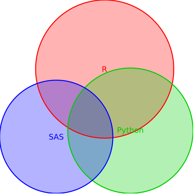
With a few modifications, I basically re-purposed Harlan’s code from the package test files. The circle result is as follows:

1
2
3
4
5
6
7
8
9
10
11
12
13
using VennEuler

data, labels = readcsv("/home/rzwitch/Desktop/kdnuggets_language_survey_2014.csv", header=true)
data = bool(data)
labels = vec(labels)

#Circles
eo = make_euler_object(labels, data, EulerSpec()) # circles, for now

(minf,minx,ret) = optimize(eo, random_state(eo), ftol=-1, xtol=0.0025, maxtime=120, pop=1000)
println("got $minf at $minx (returned $ret)")

render("/home/rzwitch/Desktop/kd.svg", eo, minx)

venneulercircles

Since the percentage of R, SAS, and Python users isn’t too dramatically different (49.81%, 33.42%, 40.97% respectively) and the visualizations are circles, it’s a bit hard to tell that R is about 16% points higher than SAS and 9% points higher than Python.

Code - Rectangles

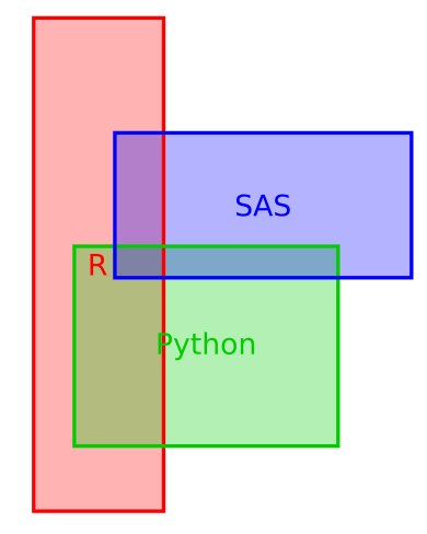
Alternatively, we can use rectangles to represent the areas:

1
2
3
4
5
6
7
8
9
10
11
12
13
14
15
16
17
18
using VennEuler

data, labels = readcsv("/home/rzwitch/Desktop/kdnuggets_language_survey_2014.csv", header=true)
data = bool(data)
labels = vec(labels)

# Rectangles
eo = make_euler_object(labels, data, [EulerSpec(:rectangle), EulerSpec(:rectangle, [.5, .5, .4], [0, 0, 0]),
    EulerSpec(:rectangle)],
    sizesum=.3)


(minf,minx,ret) = optimize_iteratively(eo, random_state(eo), ftol=-1, xtol=0.0025, maxtime=5, pop=100)
println("phase 1: got $minf at $minx (returned $ret)")
(minf,minx,ret) = optimize(eo, minx, ftol=-1, xtol=0.001, maxtime=30, pop=100)
println("phase 2: got $minf at $minx (returned $ret)")

render("/home/rzwitch/Desktop/kd-rects.svg", eo, minx)

venneulerrectangles

Here, it’s a slight bit easier to see that SAS and Python are about the same area-wise and that R is larger, although the different dimensions do obscure this fact a bit.

Summary

If I spent more time with this package, I’m sure I could make something even more aesthetically pleasing. And for that matter, it’s still a pre-production package that will no doubt get better in the future. But at the very least, there is a way to create an area-proportional representation of relationships using VennEuler.jl in Julia.


  • RSiteCatalyst Version 1.4.16 Release Notes
  • Using RSiteCatalyst With Microsoft PowerBI Desktop
  • RSiteCatalyst Version 1.4.14 Release Notes
  • RSiteCatalyst Version 1.4.13 Release Notes
  • RSiteCatalyst Version 1.4.12 (and 1.4.11) Release Notes
  • Self-Service Adobe Analytics Data Feeds!
  • RSiteCatalyst Version 1.4.10 Release Notes
  • WordPress to Jekyll: A 30x Speedup
  • Bulk Downloading Adobe Analytics Data
  • Adobe Analytics Clickstream Data Feed: Calculations and Outlier Analysis
  • Adobe: Give Credit. You DID NOT Write RSiteCatalyst.
  • RSiteCatalyst Version 1.4.8 Release Notes
  • Adobe Analytics Clickstream Data Feed: Loading To Relational Database
  • Calling RSiteCatalyst From Python
  • RSiteCatalyst Version 1.4.7 (and 1.4.6.) Release Notes
  • RSiteCatalyst Version 1.4.5 Release Notes
  • Getting Started: Adobe Analytics Clickstream Data Feed
  • RSiteCatalyst Version 1.4.4 Release Notes
  • RSiteCatalyst Version 1.4.3 Release Notes
  • RSiteCatalyst Version 1.4.2 Release Notes
  • Destroy Your Data Using Excel With This One Weird Trick!
  • RSiteCatalyst Version 1.4.1 Release Notes
  • Visualizing Website Pathing With Sankey Charts
  • Visualizing Website Structure With Network Graphs
  • RSiteCatalyst Version 1.4 Release Notes
  • Maybe I Don't Really Know R After All
  • Building JSON in R: Three Methods
  • Real-time Reporting with the Adobe Analytics API
  • RSiteCatalyst Version 1.3 Release Notes
  • Adobe Analytics Implementation Documentation in 60 Seconds
  • RSiteCatalyst Version 1.2 Release Notes
  • Clustering Search Keywords Using K-Means Clustering
  • RSiteCatalyst Version 1.1 Release Notes
  • Anomaly Detection Using The Adobe Analytics API
  • (not provided): Using R and the Google Analytics API
  • My Top 20 Least Useful Omniture Reports
  • For Maximum User Understanding, Customize the SiteCatalyst Menu
  • Effect Of Modified Bounce Rate In Google Analytics
  • Adobe Discover 3: First Impressions
  • Using Omniture SiteCatalyst Target Report To Calculate YOY growth
  • ODSC webinar: End-to-End Data Science Without Leaving the GPU
  • PyData NYC 2018: End-to-End Data Science Without Leaving the GPU
  • Data Science Without Leaving the GPU
  • Getting Started With OmniSci, Part 2: Electricity Dataset
  • Getting Started With OmniSci, Part 1: Docker Install and Loading Data
  • Parallelizing Distance Calculations Using A GPU With CUDAnative.jl
  • Building a Data Science Workstation (2017)
  • JuliaCon 2015: Everyday Analytics and Visualization (video)
  • Vega.jl, Rebooted
  • Sessionizing Log Data Using data.table [Follow-up #2]
  • Sessionizing Log Data Using dplyr [Follow-up]
  • Sessionizing Log Data Using SQL
  • Review: Data Science at the Command Line
  • Introducing Twitter.jl
  • Code Refactoring Using Metaprogramming
  • Evaluating BreakoutDetection
  • Creating A Stacked Bar Chart in Seaborn
  • Visualizing Analytics Languages With VennEuler.jl
  • String Interpolation for Fun and Profit
  • Using Julia As A "Glue" Language
  • Five Hard-Won Lessons Using Hive
  • Using SQL Workbench with Apache Hive
  • Getting Started With Hadoop, Final: Analysis Using Hive & Pig
  • Quickly Create Dummy Variables in a Data Frame
  • Using Amazon EC2 with IPython Notebook
  • Adding Line Numbers in IPython/Jupyter Notebooks
  • Fun With Just-In-Time Compiling: Julia, Python, R and pqR
  • Getting Started Using Hadoop, Part 4: Creating Tables With Hive
  • Tabular Data I/O in Julia
  • Hadoop Streaming with Amazon Elastic MapReduce, Python and mrjob
  • A Beginner's Look at Julia
  • Getting Started Using Hadoop, Part 3: Loading Data
  • Innovation Will Never Be At The Push Of A Button
  • Getting Started Using Hadoop, Part 2: Building a Cluster
  • Getting Started Using Hadoop, Part 1: Intro
  • Instructions for Installing & Using R on Amazon EC2
  • Video: SQL Queries in R using sqldf
  • Video: Overlay Histogram in R (Normal, Density, Another Series)
  • Video: R, RStudio, Rcmdr & rattle
  • Getting Started Using R, Part 2: Rcmdr
  • Getting Started Using R, Part 1: RStudio
  • Learning R Has Really Made Me Appreciate SAS