EDIT, 9/8/2016: Hive has come a long way in the two years since I’ve written this. While some of the code snippets might still work, it’s likely the case that this information is so out-of-date to be nothing more than a reflection of working with Hadoop in 2014.
I’ve been spending a ton of time lately on the data engineering side of ‘data science’, so I’ve been writing a lot of Hive queries. Hive is a great tool for querying large amounts of data, without having to know very much about the underpinnings of Hadoop. Unfortunately, there are a lot of things about Hive (version 0.12 and before) that aren’t quite the same as SQL and have caused me a bunch of frustration; here they are, in no particular order.
1. Set Hive Temp directory To Same As Final Output Directory
When doing a “Create Table As” (CTAS) statement in Hive, Hive allocates temp space for the Map and Reduce portions of the job. If you’re not lucky, the temp space for the job will be somewhere different than where your table actually ends up being saved, resulting in TWO I/O operations instead of just one. This can lead to a painful delay in when your Hive job says it is finished vs. when the table becomes available (one time, I saw a 30 hour delay writing 5TB of data).
If your Hive jobs seem to hang after the Job Tracker says they are complete, try this setting at the beginning of your session:
set hive.optimize.insert.dest.volume=true;
2. Column Aliasing In Group By/Order By
Not sure why this isn’t a default, but if you want to be able to reference your column names by position (i.e. group by 1,2) instead of by name (i.e. group by name, age), then run this at the beginning of your session:
set hive.groupby.orderby.position.alias=true;
3. Be Aware Of Predicate Push-Down Rules
In Hive, you can get great performance gains if you A) partition your table by commonly used columns/business concepts (i.e. Day, State, Market, etc.) and B) you use the partitions in a WHERE clause. These are known as partition-based queries. Otherwise, if you don’t use a partition in your WHERE clause, you will get a full table scan.
Unfortunately, when doing an OUTER JOIN, Hive will sometimes ignore the fact that your WHERE clause is on a partition and do a full table scan anyway. In order to get Hive to push your predicate down and avoid a full table scan, put your predicate on the JOIN instead of the WHERE clause:
If you don’t want to think about the different rules, you can generally put your limiting clauses inside your JOIN clause instead of on your WHERE clause. It should just be a matter of preference (until your query performance indicates it isn’t!)
4. Calculate And Append Percentiles Using CROSS JOIN
Suppose you want to calculate the top 10% of your customers by sales. If you try to do the following, Hive will complain about needing a GROUP BY, because percentile_approx() is a summary function:
1
2
3
4
5
6
--Hive expects that you want to calculate your percentiles by account_number and sales--This code will generate an error about a missing GROUP BY statementselectaccount_number,sales,CASEWHENsales>percentile_approx(sales,.9)THEN1ELSE0ENDastop10pct_sales
To get around the the need for a GROUP BY, we can use a CROSS JOIN. A CROSS JOIN is another name for a Cartesian Join, meaning all of the rows from the first table will be joined to ALL of the rows of the second table. Because the subquery only returns one row, the CROSS JOIN provides the desired affect of joining the percentile values back to the original table while keeping the same number of rows from the original table. Generally, you don’t want to do a CROSS JOIN (because relational data generally is joined on a key), but this is a good use case.
5. Calculating a Histogram
Creating a histogram using Hive should be as simple as calling the histogram_numeric() function. However, the syntax and results of this function are just plain weird. To create a histogram, you can run the following:
However, now that we have a table of data, it’s still not clear how to create a histogram, as the center of variable-width bins is what is returned by Hive. The Hive documentation for histogram_numeric() references Gnuplot, Excel, Mathematica and MATLAB, which I can only assume can deal with plotting the centers? Eventually I’ll figure out how to deal with this using R or Python, but for now, I just use the table as a quick gauge of what the data looks like.
When I set out to build RSiteCatalyst, I had a few major goals: learn R, build CRAN-worthy package and learn the Adobe Analytics API. As I reflect back on how the package has evolved over the past two years and what I’ve learned, I think my greatest learning was around how to deal with JSON (and strings in general).
JSON is ubiquitous as a data-transfer mechanism over the web, and R does a decent job providing the functionality to not only read JSON but also to create JSON. There are at least three methods I know of to build JSON strings, and this post will cover the pros and cons of each method.
Method 1: Building JSON using paste
As a beginning R user, I didn’t have the awareness of how many great user-contributed packages are out there. So throughout the RSiteCatalyst source code you can see gems like:
1
2
3
4
5
6
7
8
#"metrics" would be a user input into a function argumentsmetrics<-c("a","b","c")#Loop over the metrics list, appending proper curly bracesmetrics_conv<-lapply(metrics,function(x)paste('{"id":','"',x,'"','}',sep=""))#Collapse the list into a proper comma separated stringmetrics_final<-paste(metrics_conv,collapse=", ")
The code above loops over a character vector (using lapply instead of a for loop like a good R user!), appending curly braces, then flattening the list down to a string. While this code works, it’s a quite brittle way to build JSON. You end up needing to worry about matching quotation marks, remembering if you need curly braces, brackets or singletons…overall, it’s a maintenance nightmare to build strings this way.
Of course, if you have a really simple JSON string you need to build, paste() doesn’t have to be off-limits, but for a majority of the cases I’ve seen, it’s probably not a good idea.
Method 2: Building JSON using sprintf
Somewhere in the middle of building version 1 of RSiteCatalyst, I started learning Python. For those of you who aren’t familiar, Python has a string interpolation operator%, which allows you to do things like the following:
1
2
3
In[1]:print"Here's a string subtitution for my name: %s"%("Randy")Out[1]:"Here's a string subtitution for my name: Randy"
Thinking that this was the most useful thing I’d ever seen in programming, I naturally searched to see if R had the same functionality. Of course, I quickly learned that all C-based languages have printf/sprintf, and R is no exception. So I started building JSON using sprintf in the following manner:
In this example, we’re now passing R objects into the sprintf() function, with %s tokens everywhere we need to substitute text. This is certainly an improvement over paste(), especially given that Adobe provides example JSON via their API explorer. So I copied the example strings, replaced their examples with my tokens and voilà! Better JSON string building.
Method 3: Building JSON using a package (jsonlite, rjson or RJSONIO)
While sprintf() allowed for much easier JSON, there is still a frequent code smell in RSiteCatalyst, as evidenced by the following:
1
2
3
4
5
6
7
8
9
#Converts report_suites to JSONif(length(report_suites)>1){report_suites<-toJSON(report_suites)}else{report_suites<-toJSON(list(report_suites))}#API requestjson<-postRequest("ReportSuite.GetTrafficVars",paste('{"rsid_list":',report_suites,'}'))
At some point, I realized that using the toJSON() function from rjson would take care of the formatting R objects to strings, yet I didn’t make the leap to understanding that I could build the whole string using R objects translated by toJSON()! So I have more hard-to-maintain code where I’m checking the class/length of objects and formatting them. The efficient way to do this using rjson would be:
With the code above, we’re building JSON in a very R-looking manner; just R objects and functions, and in return getting the output we want. While it’s slightly less obvious what is being created by request.body, there’s literally zero bracket-matching, quoting issues or anything else to worry about in building our JSON. That’s not to say that there isn’t a learning curve to using a JSON package, but I’d rather figure out whether I need a character vector or list than burn my eyes out looking for mismatched quotes and brackets!
Collaborating Makes You A Better Programmer
Like any pursuit, you can get pretty far on your own through hard work and self-study. However, I wouldn’t be nearly where I am without collaborating with others (especially learning about how to build JSON properly in R!). A majority of the RSiteCatalyst code for the upcoming version 1.4 was re-written by Willem Paling, where he added consistency to keyword arguments, switched to jsonlite for better JSON parsing to Data Frames, and most importantly for the topic of this post, cleaned up the method of building all the required JSON strings!
Edit 5/13: For a more thorough example of building complex JSON using jsonlite, check out this example from the v1.4 branch of RSiteCatalyst. The linked example R code populates the required arguments from this JSON outline provide by Adobe.
If you’ve spent any non-trivial amount of time working with Hadoop and Hive at the command line, you’ve likely wished that you could interact with Hadoop like you would any other database. If you’re lucky, your Hadoop administrator has already installed the Apache Hue front-end to your cluster, which allows for interacting with Hadoop via an easy-to-use browser interface. However, if you don’t have Hue, Hive also supports access via JDBC; the downside is, setup is not as easy as including a single JDBC driver.
While there are paid database administration tools such as Aqua Data Studio that support Hive, I’m an open source kind of guy, so this tutorial will show you how to use SQL Workbench to access Hive via JDBC. This tutorial assumes that you are proficient enough to get SQL Workbench installed on whatever computing platform you are using (Windows, OSX, or Linux).
Download Hadoop jars
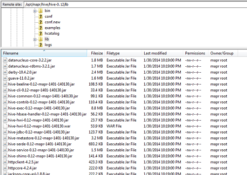
The hardest part of using Hive via JDBC is getting all of the required jars. At work I am using a MapR distribution of Hadoop, and each Hadoop vendor platform provides drivers for their version of Hadoop. For MapR, all of the required Java .jar files are located at /opt/mapr/hive/hive-0.1X/lib (where X represents the Hive version number you are using).
Download all the .jar files in one shot, just in case you need them in the future
Since it’s not always clear which .jar files are required (especially for other projects/setups you might be doing), I just downloaded the entire set of files and placed them in a directory called hadoop_jars. If you’re not using MapR, you’ll need to find and download your vendor-specific version of the following .jar files:
hive-exec.jar
hive-jdbc.jar
hive-metastore.jar
hive-service.jar
Additionally, you will need the following general Hadoop jars (Note: for clarity/long-term applicability of this blog post, I have removed the version number from all of the jars):
hive-cli.jar
libfb303.jar
slf4j-api.jar
commons-logging.jar
hadoop-common.jar
httpcore.jar
httpclient.jar
Whew. Once you have the Hive JDBC driver and the 10 other .jar files, we can begin the installation process.
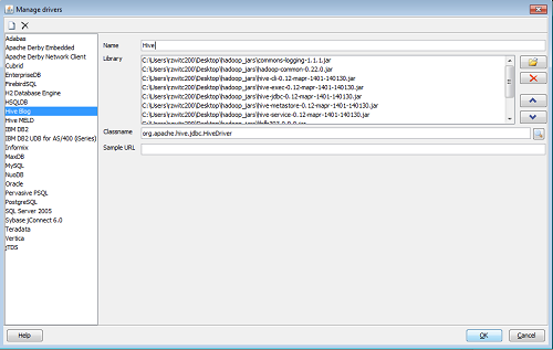
Setting up Hive JDBC driver
Setting up the JDBC driver is simply a matter of providing SQL Workbench with the location of all 11 of the required .jar files. After clicking File -> Manage Drivers, you’ll want to click on the white page icon to create a New Driver. Use the Folder icon to add the .jars:
For the Classname box, if you are using a relatively new version of Hive, you’ll be using Hive2 server. In that case, the Classname for the Hive driver is org.apache.hive.jdbc.HiveDriver (this should pop up on-screen, you just need to select the value). You are not required to put any value for the Sample URL. Hit OK and the driver window will close.
Connection Window
With the Hive driver defined, all that’s left is to define the connection string. Assuming your Hadoop administrator didn’t change the default port from 10000, your connection string should look as follows:
As stated above, I’m assuming you are using Hive2 Server; if so, your connection string will be jdbc:hive2://your-hadoop-cluster-location:10000. After that, type in your Username and Password and you should be all set.
Using Hive with SQL Workbench
Assuming you have achieved success with the instructions above, you’re now ready to use Hive like any other database. You will be able to submit your Hive code via the Query Window, view your schemas/tables (via the ‘Database Explorer’ functionality which opens in a separate tab) and generally use Hive like any other relational database.
Of course, it’s good to remember that Hive isn’t actually a relational database! From my experience, using Hive via SQL Workbench works pretty well, but the underlying processing is still in Hadoop. So you’re not going to get the clean cancelling of queries like you would with an RDBMS , there can be a significant lag to getting answers back (due to the Hive overhead), you can blow up your computer streaming back results larger than available RAM…but it beats working at the command line.